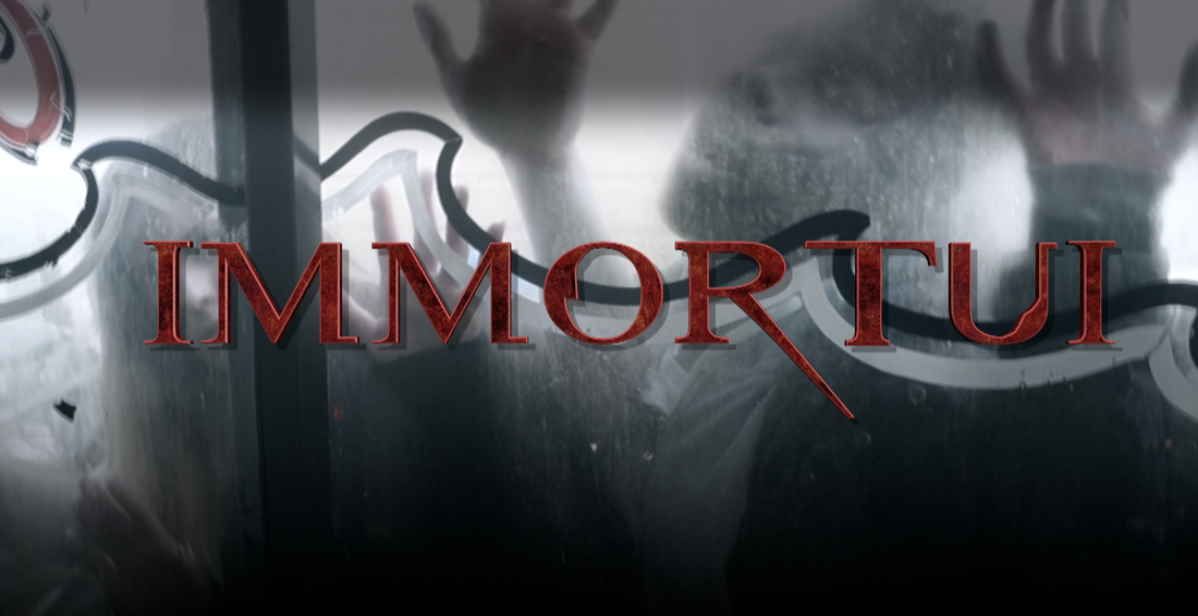
For our main fonts we decided to use a sharp and blooded font. Therefore we used this one that represented the blood well given its style and colour. The colour already gives quite horrifying connotations but when matched up with the way the words are drawn it really does give off quite gory vibes.
For our main production company clip we decided to use darkened font which makes you think of stereotypes such as darkness, death and emptiness. Given that this font dosent stay up for very long onscreen it didnt matter to much what it looked like so long as it was easy to read and looked appropriate.

